Lily Sarah Grace
In April of 2014, we received an email from our friends at Osk Studio about building a website for an arts foundation. Osk was looking for a partner to build the front-end of the site. After a few emails back and forth, we had a phone call with Osk to go over the details of the project.
The project was a new site for the Lily Sarah Grace Foundation. The more we learned about the foundation, the more excited we were about creating a site for them worthy of the work they were doing. Arts education is being cast aside in America, and LSG is doing wonderful things to counter that trend.
Osk had already completed most of the design work in-house. What was left for us to complete were the interaction states and the ways the design would need to be altered for smaller screens. We created a project outline that set out three distinct deliverables that would get us to an on-time launch.
Our Approach
We believe strongly in taking a systematic approach to the sites we build. While this works best with large sites with generous deadlines, we don't like to shortcut it. Thinking of a website as a system made up of smaller components is beneficial even for a smaller site like the one we were building. Osk had given us a really beautiful and well-structured set of design comps to work with, so we set about breaking them apart.
Workflow
Once we had our timeline together, we started building out a working prototype of the design that would eventually become the completed site. We love to get to a functioning prototype as soon as we can, and Osk was totally on board with reviewing our work and suggestions as a fully functioning website.
We used Grunt to structure the prototype, and set up a loose skeleton of Handlebars templates, Sass files, and JavaScript modules in our first pass. Among the first challenges we wanted to tackle were the changes to the design for smaller screens. Osk had done a wonderful job of using consistent font styles in their designs, so we started there and worked to document the styles we were crafting in an isolated page.
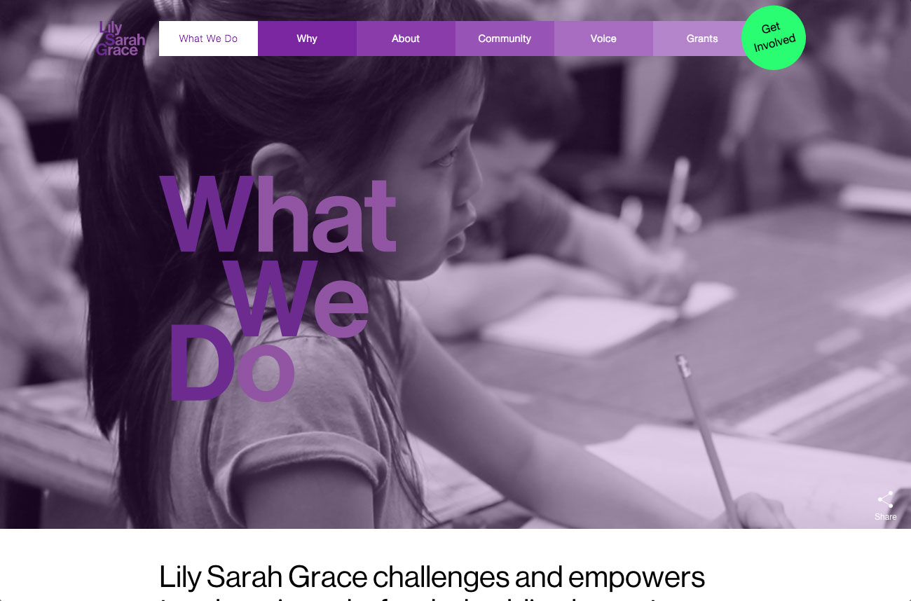
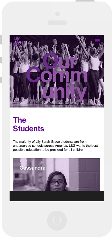
Working with the desktop designs as our starting point, we quickly set up the page templates and styled them to match the designs that Osk had given to us, with consideration for a flexible width. From there we made specific adjustments to the components that were not working on smaller screens. The navigation needed to be redesigned, and many of the large typographic elements of the site needed resizing. This process was repeated as we continued to build out the site's functional pieces.
Challenges
One of the more challenging aspects of the build involved the seamless transitions that we incorporated into the bottom of each page. The goal was to have a preview of the next page that would seamlessly animate the transition to the new page when the user clicked on it.
In order to achieve this, we needed to structure the markup and styles for the header of our pages to match the footer as closely as possible. The code also had to support animating the content from the footer up to the header in a smooth manner that would deliver an experience that exceeded the user's expectations. After several iterations and 90 lines of JavaScript code, we had our solution. It worked beautifully and is still one of the things we're proudest of on the site.
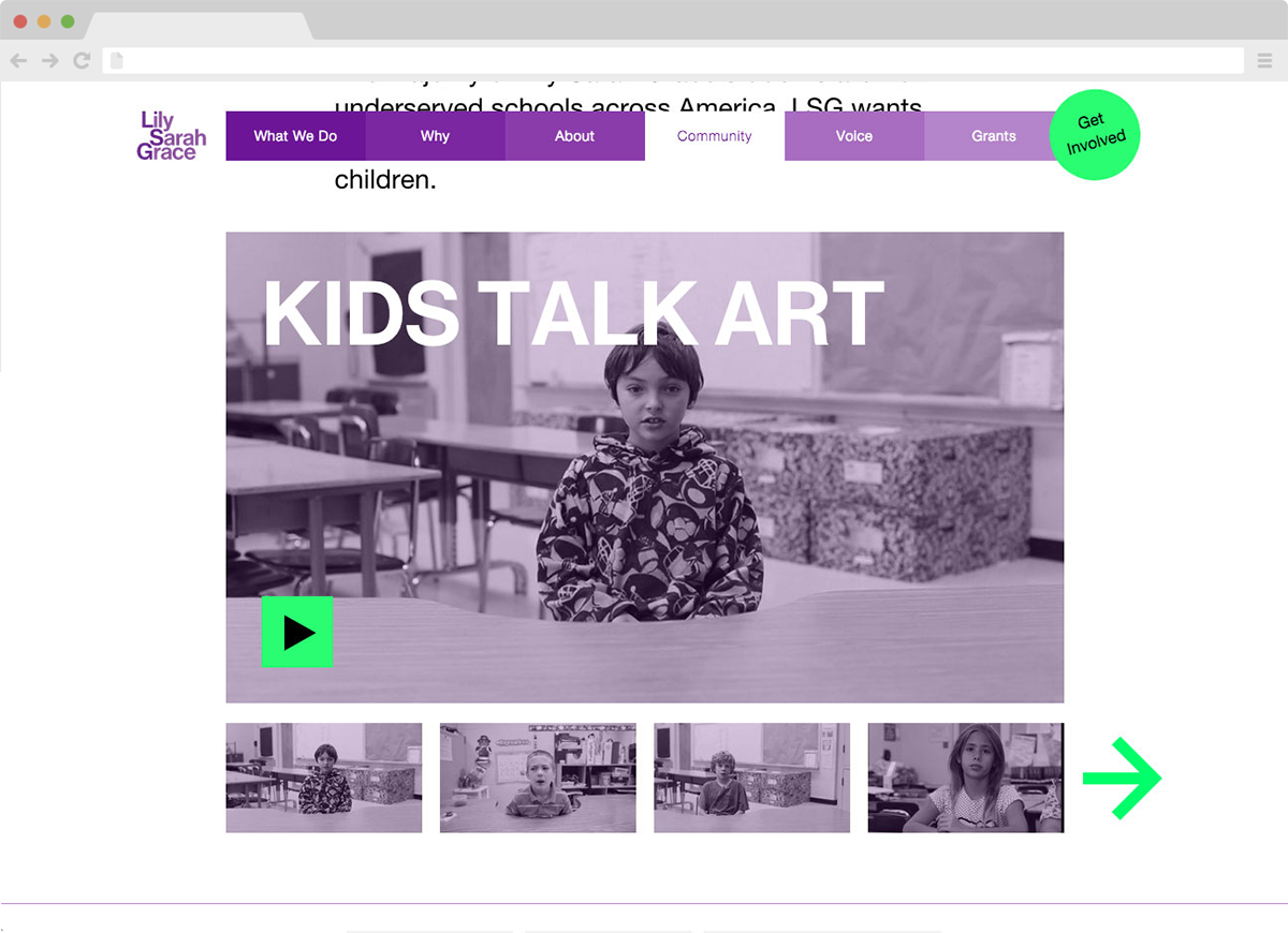
Aside from the page transitions, we also spent considerable time getting the typography right for the page headers, and experimenting to apply the purple cast to all of the site's images. For the latter, we experimented with SVG filters, but in the end, the simple approach of a semi-opaque color overlay provided the most desirable results.